Fly Like an Eagle
Earlier this year, we were selected to develop the brand for Terri Eagle Group. The “next adventure” from Terri Eagle, the visionary business executive and author of The Champagne CEO, Terri has assembled a dynamic team of highly skilled business strategists and specialists. Their goal is to work alongside teams and help them unlock growth by increasing brand awareness, streamlining operations, and implementing best practices within the financial, human resources, and legal operations.
For more info about the Terri Eagle Group, check out this press release or contact them directly via their new website.
The Brand Development and Story
Typography
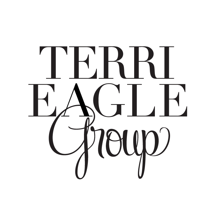
We set “TERRI EAGLE” in a bold, serif typeface, conveying authority, tradition, and reliability.
The word “Group” is rendered in a script-style font, which adds a touch of personalization, approachability, and creativity. This contrast suggests the Terri Eagle Group brand balances professionalism with a warm, client-centered approach, just like Terri herself.
Hierarchy & Layout
The stacked layout (with “Terri Eagle” on top and “Group” below) emphasizes the Terri’s name as the leadership of the group.
However, Terri impressed how important the “group” is and it’s that cohesiveness that makes their team truly dynamic, so we integrated the “group” within the “A” in Eagle. This structure helps reinforce the identity of Terri Eagle Group as a collaboration.


